Hotspot
The hotspot is a visible button with customizable icon and label.
Basics

Use the hotspot as a visible button to easily make your workouts interactive.
Hotspot Styles
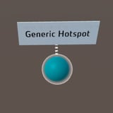
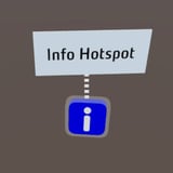
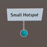
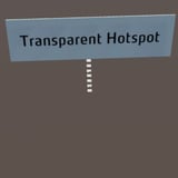
For the display of hotspots in the training you have the choice between appearance styles for different purposes.
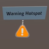
Selection logic of hotspots
Hotspots have (besides normal and highlight) also a selected state. This selected state is created when you display / play the hotspot with one of the actions Show Image, Show Video, Show Text or Play Sound content. The selected state is not exclusive, i.e. any number of hotspots can be selected at the same time.
This logic was changed with the change to version 2020.4.

Up to version 2020.3, one hotspot could be in selected state at a time, i.e. when a new hotspot was placed in selected state, this simultaneously ended the selected state for the other hotspot. If you have built a training that relies on this logic, please enable Hotspot Single Selection in the legacy options of the training. Since version 2020.4, any number of hotspots (independently) can be in the selected state.
Working with the Hotspot
The following functions are available for working with the hotspot:
Editing the properties
Select the object in the scene column.
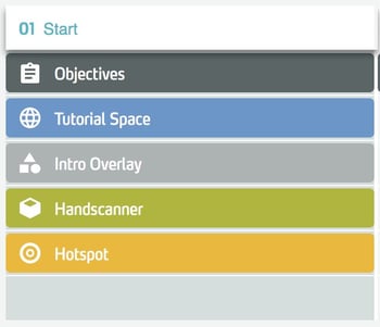
In the right side panel, edit the properties of the object.
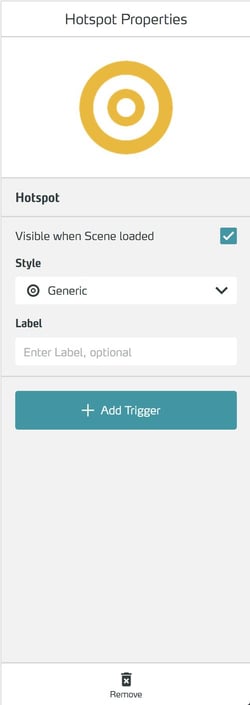
Set visibility at the beginning of a scene
To set the visibility of the object at the beginning of the scene, check the Visible When Scene loaded checkbox. You can make invisible objects visible later using the Action Show Asset.

For global objects, you control the visibility for each scene directly in the scene column using the eye icon.

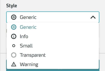
In the Style drop-down menu you can customize the appearance of the button.

Select the style you want.
To add a label to the hotspot, write it in the Label field.